

Markaaz Correct Your Data Feature
Key feature redesign for the Small Business Dashboard
Helping small businesses review, verify and correct their publicly available business data to improve access to needed services.
Markaaz is a data-driven scale-up offering SaaS products that empower small businesses and enterprises.
With inaccurate public business data deterring many small businesses from accessing the services they need to grow, Markaaz designed a Correct Your Data feature to empower users to take control of their data. This feature allows small businesses to review, verify and correct their publicly available business data to improve approval rates.
MY ROLE
UX/UI Design, User Flows, Prototyping, Product Strategy
TIMELINE
2 months
TOOLS
Figma, Adobe Photoshop, Google Forms, Shopify
THE CHALLENGE
Though users saw the value in the outcome of this feature, they were unsure how to interact with our existing interface. The feature itself confused and overwhelmed users which deterred them from getting started as they weren’t sure how to do so. This rendered the feature almost unusable, and as a key feature of the SMB Dashboard, it impacted our goal to increase conversions.
THE SOLUTION
Redesign the Correct Your Data feature so that the experience is intuitive for users from start to finish and product conversions increase.
Discovery
MARKET RESEARCH
Simplify the Complex & Unique
To try to understand best practices with this kind of interface, I first tried to conduct some market and competitor anlysis research. However, given the uniqueness and complexity of this solution in our industry, I was unable to find any other platforms that offered anything similar to ascertain these insights. Understanding how unique and complex this feature was really made simplifying and clarifying the feature essential as users will not have experience navigating similar interfaces.
USER RESEARCH
Assumptions & Feedback
As a new but key feature of our SMB Dashboard, we had very limited access to direct users to interview just yet, so we made assumptions based on feedback we had gotten from potential customers, stakeholders and target users regarding core user pain points, confusions and goals.

KEY INSIGHTS
Through usability testing and an audit of the existing process, I was able to pinpoint some key pain points issues in the existing product to focus my approach.
Explore & Ideate
REDESIGN GOALS
Simplify, Clarify, & Guide
Guided by the Key Insights, I outlined goals for the redesign and ideated solutions.
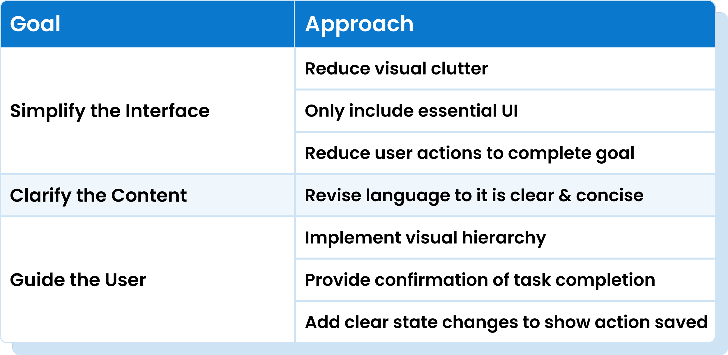
To resolve user overwhelm, I will simplify the interface.
To resolve user confusion, I will clarify content.
To help users understand when they’re done, I will guide users through the process.
SIMPLIFYING THE USER FLOW
Removing Unnecessary User Actions
With the goal of saving users time by reducing user interactions, I redesigned the user flow to remove the unnecessary user interaction for correct data rows. Removing these steps led to a 80% reduction in steps in the correct data user task flow.
Design & Iterate
ITERATION 1
Essential UI Only
With the redesign goals set, I iterated on the existing UI focusing first and foremost on simplifying and reducing to only essential content.
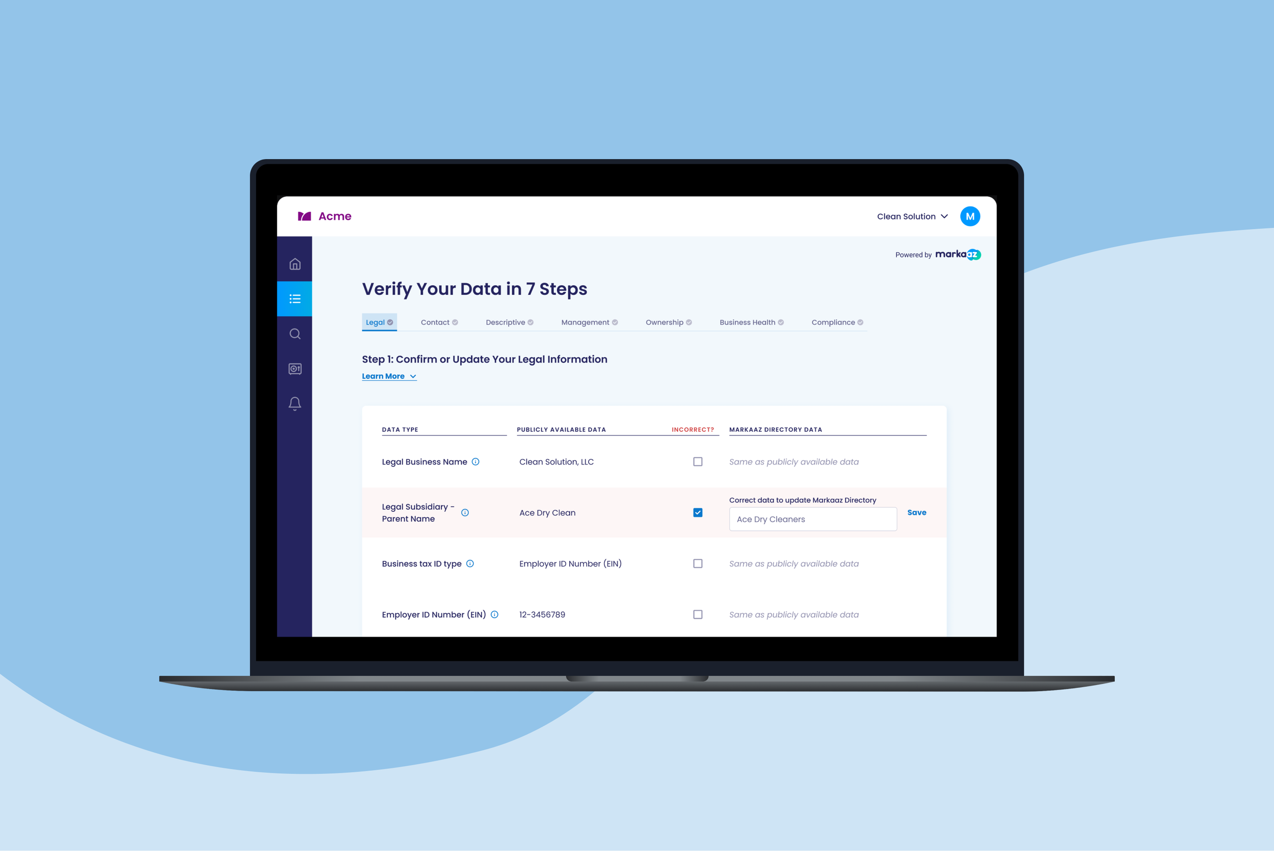
To Simplify: I removed the editable text box for ‘Correct’ rows per the new user flow
To Guide: I added a status indicator for a corrected input to show task completion
To Clarify: I played around with language to ensure content was clear
ITERATION 2
The New Flow
After simplifying the overall UI, I focused on the UI for each phase of the flow for both the Default/Correct path and the Incorrect path, trying out different options for submitting multiple inputs.
To Simplify: I reduced visual clutter by removing the ‘Correct’ selector which reduced user steps to only making selections on ‘Incorrect’ rows.
To Simplify, Clarify & Guide: I removed the colorful ‘Match’ pills & background color for ‘Correct’ rows, improving visual hierarchy by removing distracting colors and removing the confusing language ‘Matching’.
To Guide: I added in a ‘Save’ button to allow users to save inputted data before moving on to next steps.
To Guide: To account for multiple input submissions such as needing to edit in case of error, I ideated 3 versions of the ‘Edit’ UI, and asked stakeholders from product, design and marketing teams to vote on their ideal solution. Ultimately we moved forward with the most cohesive option, the ‘Edit’ text button version.
ITERATION 3
Reformatting for Clarity
Realizing my new iteration no longer indicated the ‘Data Type’ in both columns, I reformatted the table to ensure the ‘Data Type’ was clear across the row and moved forward with the text buttons for editing and saving inputted content based on team feedback.
To Clarify: I included a column solely for ‘Data Type’ so the type of data is clear for the entire row of content.
THE FINAL SOLUTION
Reduced Visual Clutter
By replacing the text in the last column with the same copy, users can quickly understand via a quick scan what the data in this column means, what they are supposed to do, and easily see any sections requiring action.
Less Interactions - Time Saved
Assuming that there will be more correct rows than incorrect, the default setting will indicate correct, requiring user action only when the field is incorrect. This will reduce clicks, making this feature faster, easier and more convenient to use, while also really focusing the user’s attention on the which data is incorrect. It now gives user a clearer picture of what needs to be changed and monitored.
Keep Only Necessary UI
This new process only makes the editable text box available when a user indicates that an edit is needed by selecting ‘Incorrect’, reducing user confusion over unnecessary UI components.
Removed Distracting Colors
With only the red ‘incorrect’ sections being highlighted, it’s easier for users to quickly scan the page for their inputs and make necessary changes as needed with distractions removed and visual hierarchy implemented.
Peace of Mind
Users receive feedback when their submission was received by Markaaz which leads to a sense of completion and peace of mind.
Multiple Input Capability
This new flow adds the capability for users to first make a selection as to the correctness of the data and if incorrect, make a second input with the corrected data, before finally submitting that input. These inputs are now triggered by previous actions with updated state changes to indicate the next step as well as input receipt.
Edit Capability
This new flow adds the capability for users to easily edit inputs if they make an error, with clear state changes indicating the input change and receipt.
Clear Language
The copy has been edited and structured to be concise and clearly convey column content and required user action, removing anything that was abstract or unclear to the average user. This saves users time and reduces confusion.
Results
VALIDATION
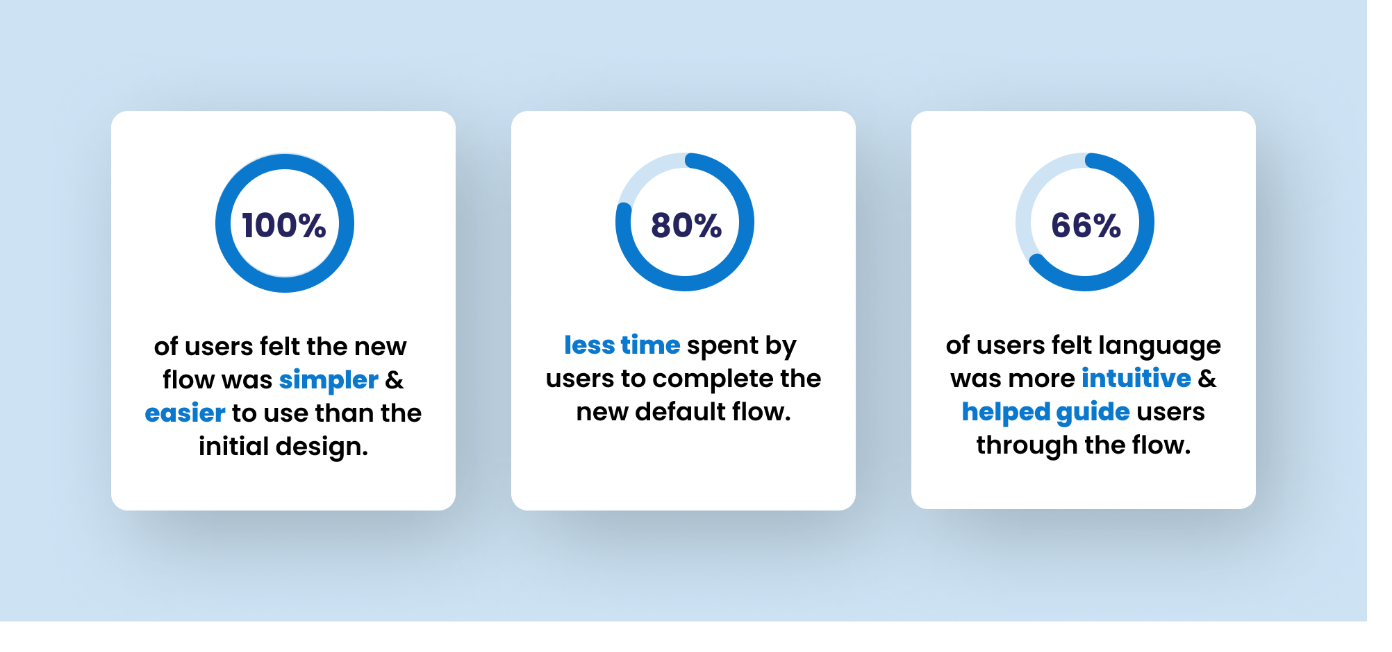
To validate my solutions, I had 3 participants test the new flow with an interactive prototype, and provide feedback on the redesigned feature. Testers validated that there had been improvements in simplicity, clarity and user guidance.
FUTURE OPPORTUNITIES
A Score for Improved Retention & Engagement
This new design allows for a business data health ‘score’, providing a percentage of incorrect data available publicly once the user completes the process. The score can then prompt continued user action and engagement via monitoring, learning about correcting data publicly, or aiming to improve the score. This would provide a personal value incentive from the result of this feature, leading to more time spent on the platform.
Additional User Guidance Beyond Feature UI
While I focused solely on the redesigning the feature itself given the constraints on this project, I’d love to explore ways to use the full CYD screen space to include additional guides to reduce user learning further and make the process even more intuitive. This could include using the description section to include clearer instructions for use, or including guiding prompt pop-ups for the initial user journey with to aid the user through the process.
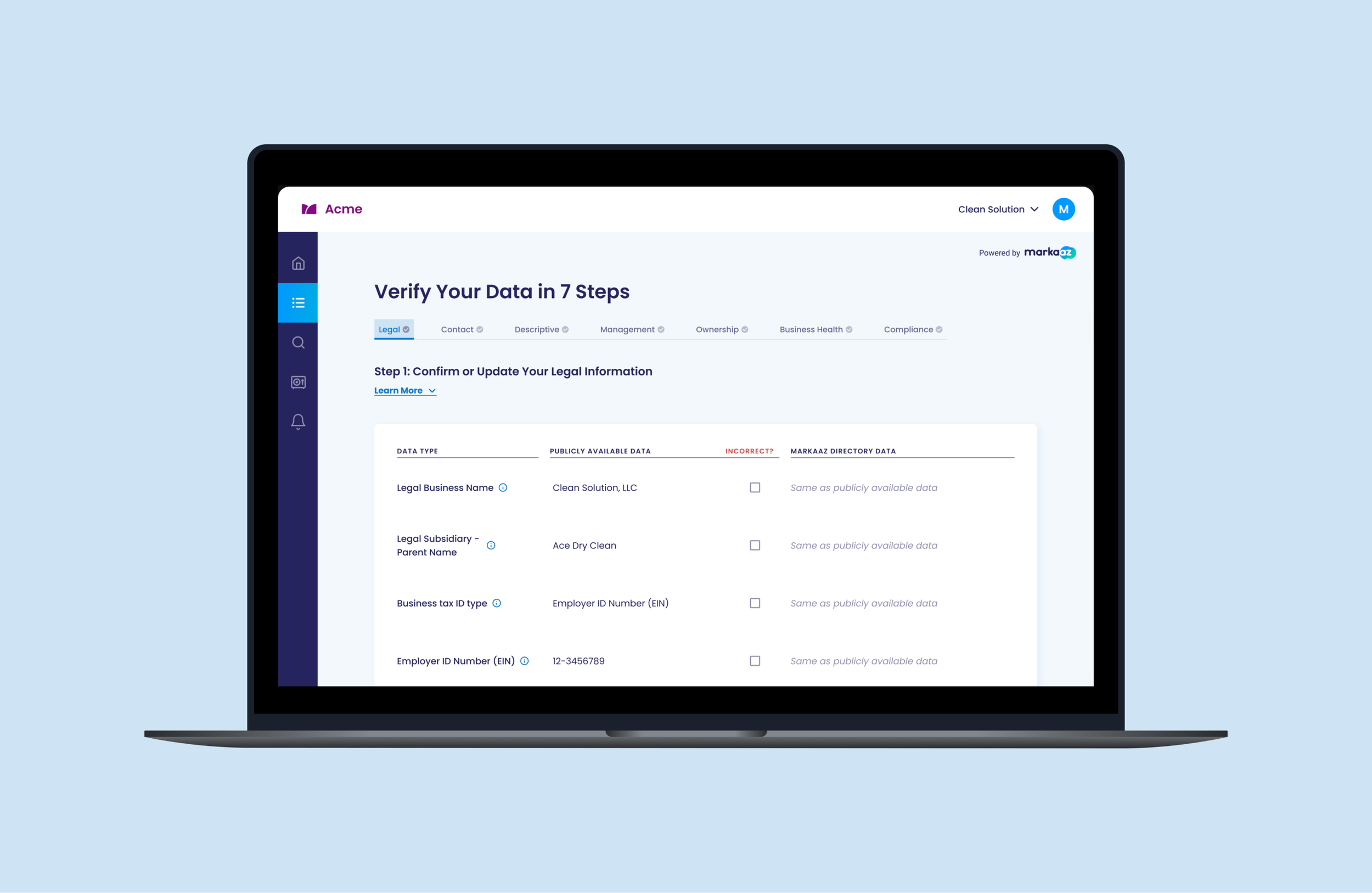
Final Prototype
Reflection
LEARNINGS
Spearheading this redesign was both a lot of fun and very impactful on our platform. I learned a lot throughout the process:
UX Writing & Taking Initiative
The confusion caused by language in this feature highlighted the importance of clear, concise, terminology and the value of UX Writing. As a small startup, our team could not invest in a UX Writer, and our typical process was to collaborate with Product and Marketing to balance the technical language with our intended messaging. To ensure completion of this project within the deadline, I took initiative and approached this redesign with a UX Writer mindset - researching and testing language collaboratively until the terminology was more common and clear.Using Data to Validate Solutions
There was one stakeholder who held out preference for the original design (containing many colors) which he had initially pushed for. In order to advocate for our user’s needs, it was key for me to rely on the data-driven results gleaned in user testing and research to persuade this stakeholder that the redesigned feature resolved user pain points and better met their needs.Working within Constraints
As a startup with a limited budget for dev hours, a challenge I regularly had to face was the challenge of convincing stakeholders to allocate hours to UX improvements. The functionality and usability of this feature was essential to our platform, and going to bat for our users to prioritize these usability updates was common. Through this, I learned the importance of approaching these discussions with empathy and communicating effectively across teams to ensure our user’s needs were being prioritized.
Thank you so much for taking the time to read my case study, if you have any questions or feedback, I’d love to connect!