

RXNT · Patient Experience · Healthcare · 2025
The Login Screen Was a Patient Care Problem
70,000 patients. Thousands couldn't get in. Not a bug - a credential system that was never designed for how patients actually use healthcare software.
ROLE
Lead Designer (UX, Research & Product Strategy)
PLATFORMS
Web + iOS + Android
TOOLS
Figma · FigJam · Miro
TEAM
Me · 1 PM · 3 Engineers · 1 Security
OVERVIEW
RXNT's patient health record portal was hemorrhaging users - not because of bad features, but because patients couldn't log in. The credential system assumed daily usage. Healthcare doesn't work that way. I redesigned the entire auth experience from scratch: replaced username/password as the primary path with a demographics-based flow, overhauled every broken recovery flow to work across all devices, rebuilt every error state with honest messaging, and finally gave patients a way to move between multiple accounts without logging out and back in - all while working closely with engineering and security to ensure PHI stayed protected the whole way through.
OUTCOMES

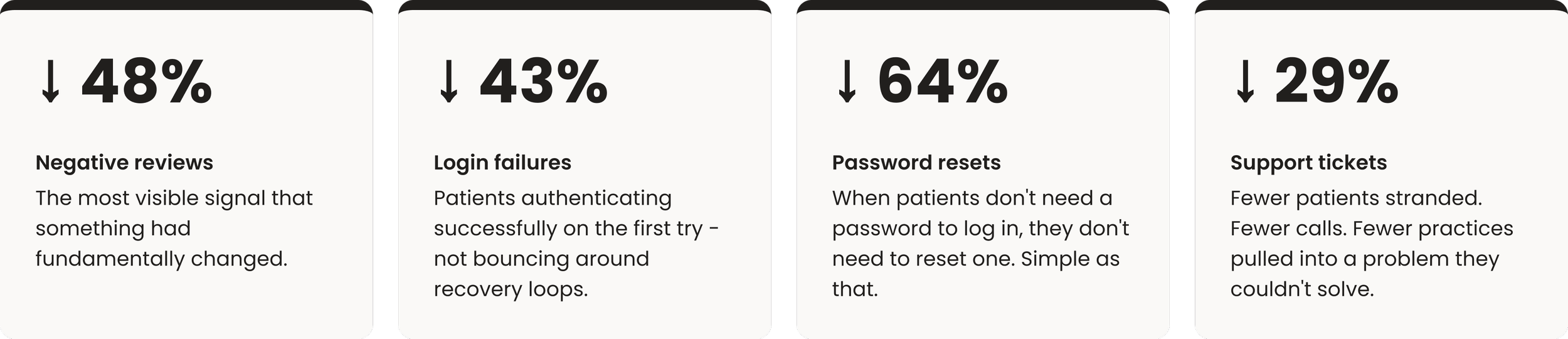
Four metrics. Four layers of the same problem. All moving in the same direction after launch.
THE PROBLEM
Patients were being locked out of their own healthcare.
The PHR is how patients access appointments, test results, provider messages, and bills. Logging in is almost always urgent - they're sick, they have results to check, they need to reschedule. When login fails at that moment, it's not a UX problem. It's a locked door at the worst possible moment.
The reviews made it impossible to ignore. Patients weren't describing a confusing interface. They were describing a system that had completely failed them.
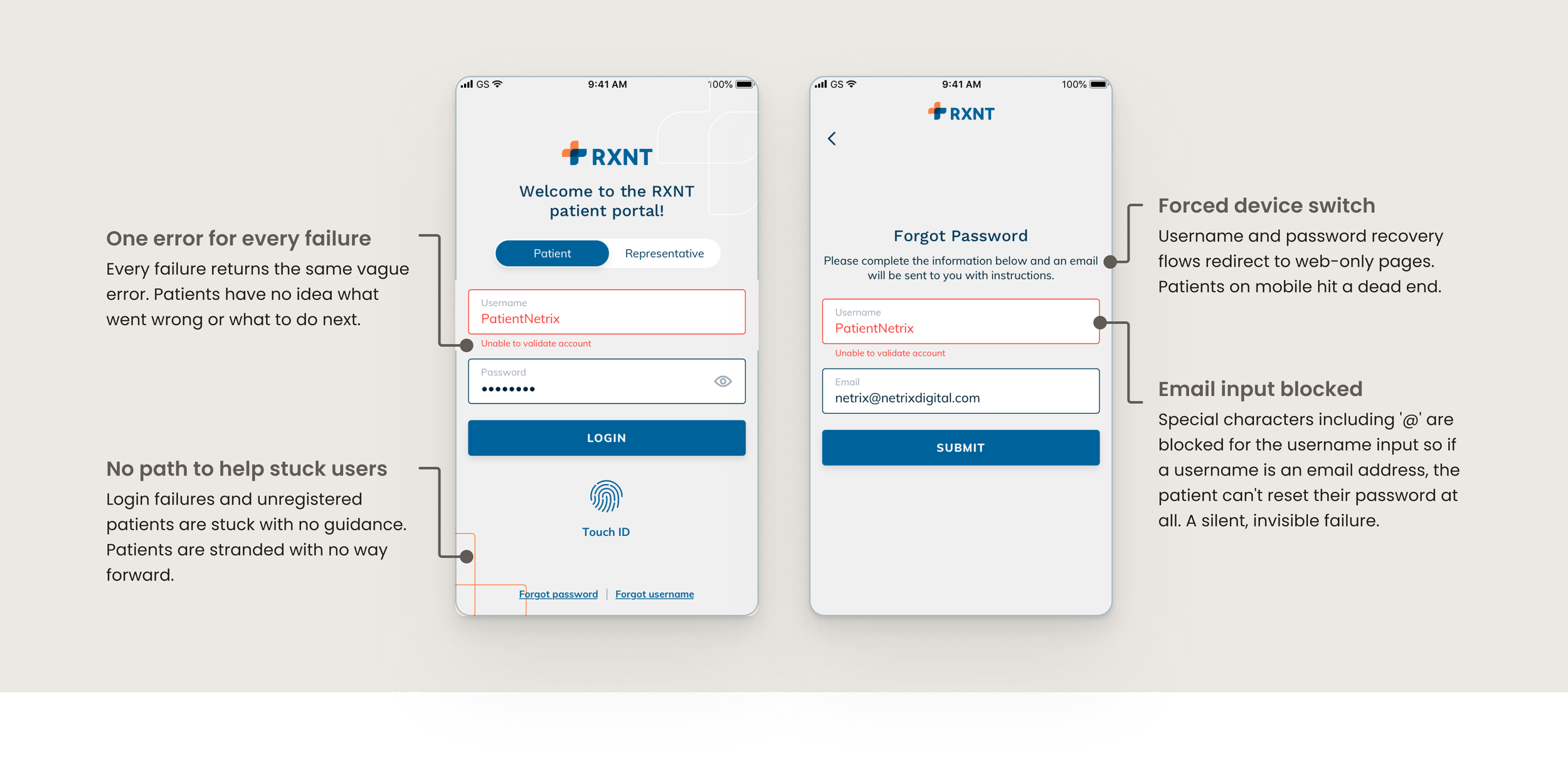
The original experience - generic errors, recovery paths that led nowhere, credentials patients hadn't thought about in two years.
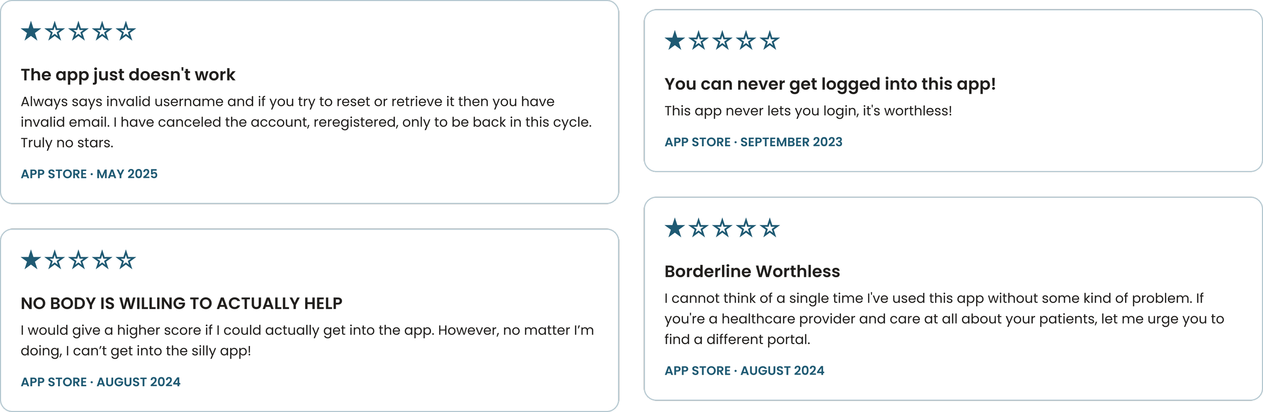
Real patient reviews, all login-related. Averaged 4 per month before the redesign.
The one that stuck: a patient bounced between their doctor's office and support, nobody able to help, completely stranded. The design failure had become an organizational failure - and the patient was stuck in the middle of it.
THE INSIGHT
Username and password works if you log in every day. Our patients log in twice a year.
One constraint shaped the entire research process: patients aren't RXNT's direct customers - they're extensions of the medical practices we serve. PHI compliance made direct patient research off the table entirely. So instead of talking to users, we listened differently by mining app store reviews, support tickets, and practice feedback for the signal that interviews would have given us. Constraints like this don't make research weaker. They make you more creative about where you look.
What we found: credential systems assume frequent use. Health portals don't get that. Patients set up accounts in waiting rooms, logged in once or twice, and then life happened. Two years later they're locked out of their own records with no reliable way back in.
And that was the simple case. Deeper in the data: patients with multiple accounts - a patient login and a guarantor login, family members sharing one email, old accounts from practices they'd left. The system had no concept of any of this. Every edge case hit the same dead end.
DESIGN INSIGHT - REVIEW ANALYSIS & SUPPORT TICKET SYNTHESIS
What does a patient always know about themselves? Not a username they created under pressure three years ago. Not a password they've reset twice since then. But their name, their date of birth, their phone number - that's always there. That became the foundation of the new login.
WHAT I DESIGNED
Replace the credential system. Fix every fallback. Handle every edge case.
This wasn't a visual refresh. It was a structural replacement - rethinking the primary login path, every error state, and the multi-account experience from scratch. Three decisions shaped everything.
Demographics + MFA as the primary login path
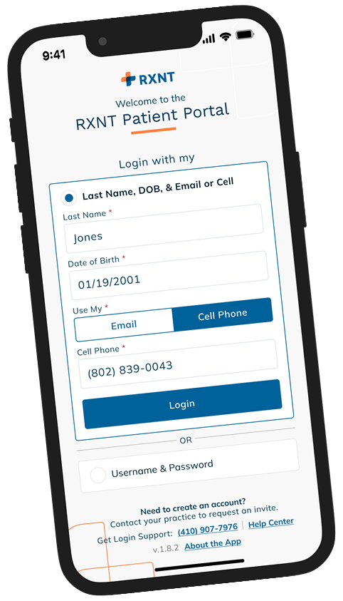
The new default asks for information patients always have — last name, date of birth, phone or email on file — followed by a one-time code. Username and password stays as a secondary option, but the primary path no longer depends on credentials patients can't maintain.
Why → MFA wasn't a UX choice - it was a PHI compliance requirement. The design challenge was making a mandatory security step feel as light as possible: clear instructions, obvious resend, honest expiry messaging, and rate limiting that doesn't punish patients who mistype once.
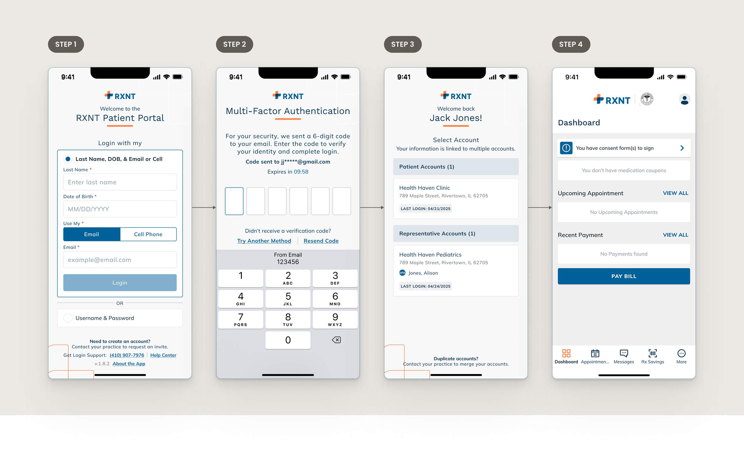
Demographics entry → MFA verification → account selection (if multiple records) → PHR access. No username. No password. No recovery loop.
Every error state tells the truth
The old system stranded patients with generic errors and no way forward. The new design maps every failure to a specific message: pending accounts are told their account is being set up, demographic mismatches get a suggestion for what to check, rate-limited users see exactly when they can retry.
Why → One of the highest-impact changes in the entire redesign. Patients who know what happened and what to do next don't call the practice. They fix it themselves.
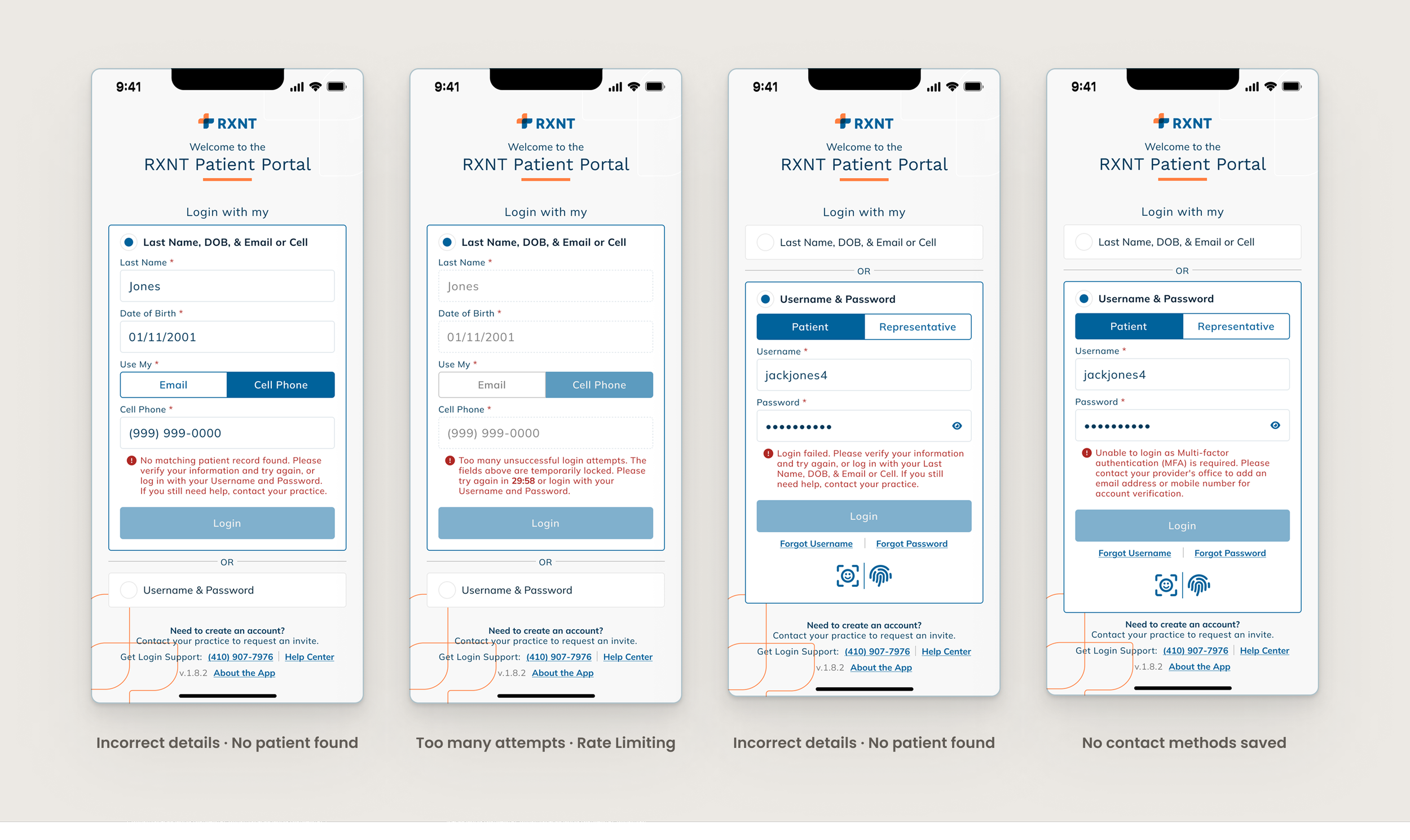
Varying failure types → specific honest messages. Not "something went wrong" - the actual reason, with the actual next step.
Multi-account selection as a first-class experience
The old system had no concept of one person managing multiple accounts — a guarantor, a caregiver, a patient with accounts at two practices. After identity verification, the new flow surfaces all matching records with enough context to know which is which. One login path, every account.
Why → Caregivers managing family members' healthcare or patients with accounts across multiple practices no longer need separate credential sets for each account. The system caught up with how people actually live.
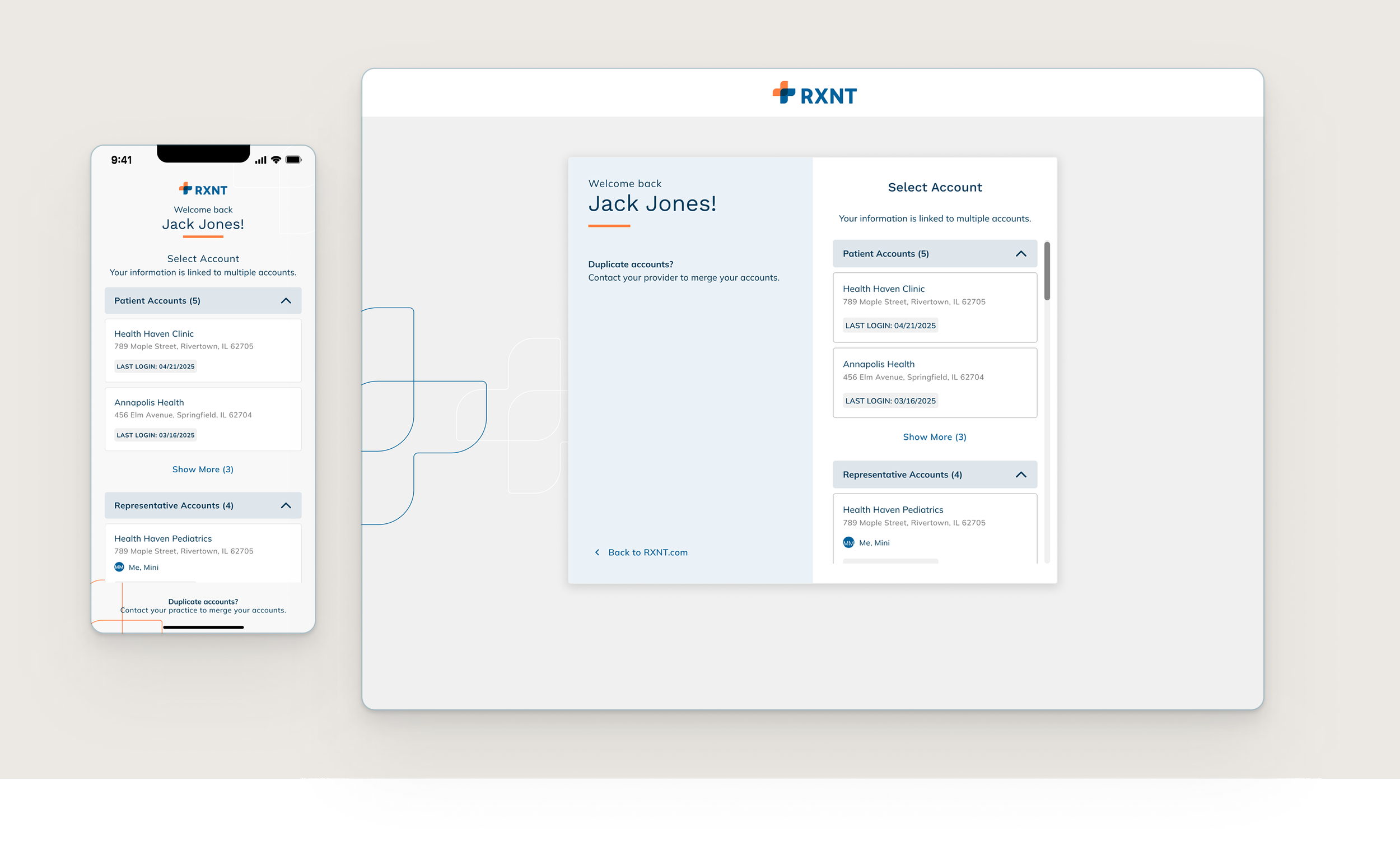
After identity verification, all matching accounts surface in a single screen - labeled by type and practice. Finally: the system knows caregivers exist.
Recovery flows fixed and made consistent across surfaces
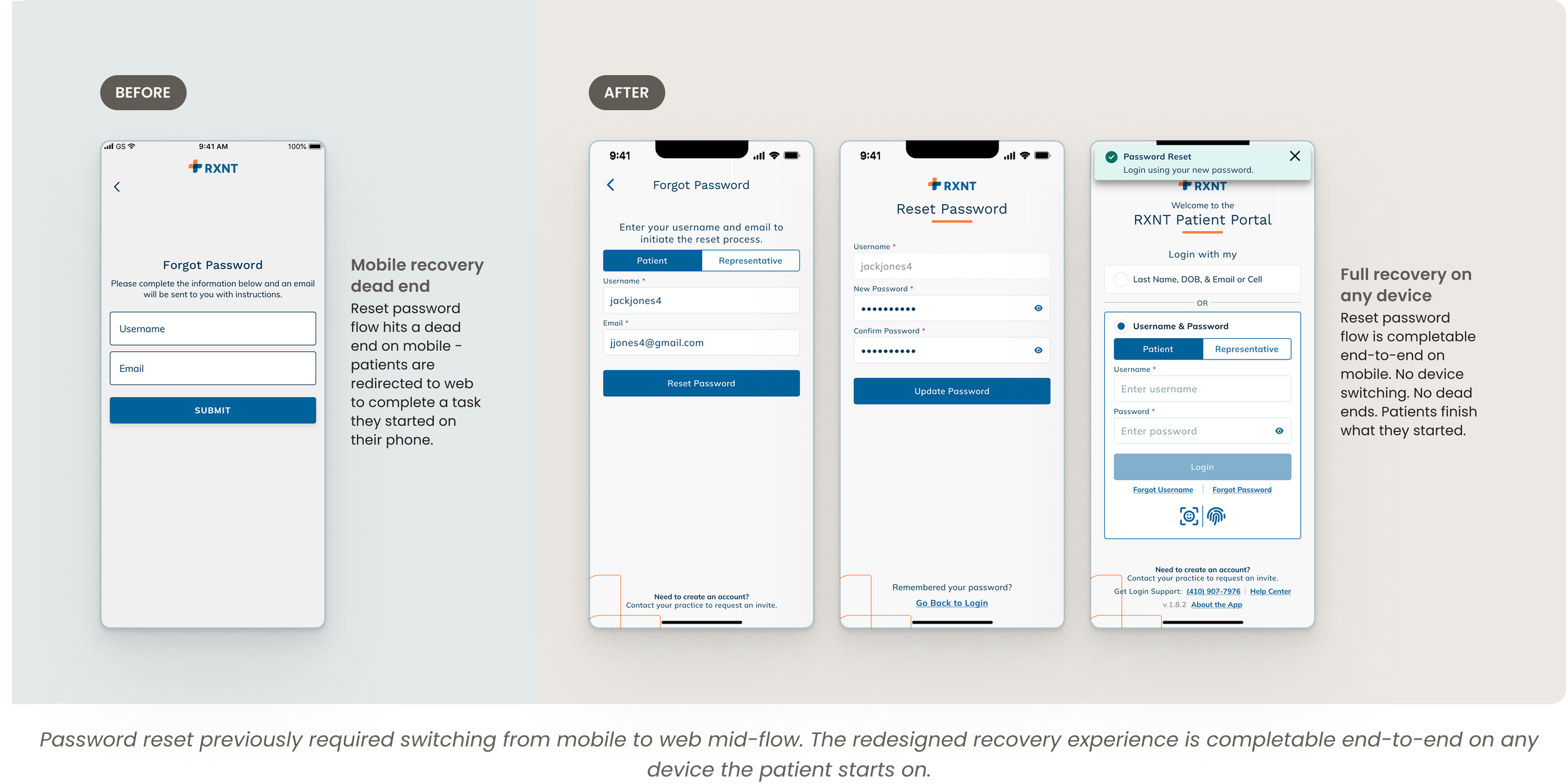
The old recovery experience was broken in different ways depending on where you were. On web, "forgot username" promised an email that never arrived - the username just silently populated on screen instead. On mobile, the reset password flow hit a dead end entirely, redirecting patients to web to finish a task they'd started on their phone. Patients trying to recover access weren't just failing - they were being misled or abandoned mid-flow.
Why → Redesigning the primary login path wouldn't matter if the fallback flows were still broken. Both recovery paths were audited and rewritten to be honest and completable - the forgot username flow now does what it says, and the reset password flow works end-to-end on the device the patient started on.
THE IMPACT
Four metrics. One story.
The 64% drop in password resets is the number that tells the real story. That's not a support metric - it's direct evidence the demographics path is being used. If patients were still falling back on credentials at the old rate, resets would barely have moved. They dropped by almost two thirds. Patients found the new path and used it.
The reviews changed in character too. The ones that remained after launch were about features and edge cases — not about being unable to get in at all. That qualitative shift mattered as much as any of the numbers.
WHAT I’D DO NEXT
The questions the metrics are already asking.
OTP completion rate: Where are patients dropping off in the new demographics flow? That's where friction still lives.
Demographics vs. credential split: Are patients actively choosing the new path, or defaulting back? The trend over time tells us how sticky the change really is.
Multi-account usage: How common was the caregiver use case, really? High volume here validates that this edge case was underserved, not just underdocumented.
First-login experience: New patients have no frame of reference for the demographics flow. A lightweight orientation layer at account creation could reduce early abandonment significantly.